The metadata of books in library collections provides myriad possibilities for visualization and visual navigation. To this end, we enriched catalog metadata with cover images, textual descriptions and reviews of books, and experimented with visualizing these book records.
As stated in the description of the Visual Navigation Project, our information environment is in a highly transitional phase. While in the past we predominantly browsed physical materials, this has been gradually replaced by interactions in the digital realm. However, features of current library catalogs often fall short of end-user expectations, and do not make full use of the opportunities the rich catalog data that libraries possess. Especially for open-ended explorations and topic-based searches, current solutions are not necessarily optimal.
Therefore, we are currently investigating the possibilities for alternative visualization and navigation, in the process also getting more insights into the needs for metadata enrichment that may be necessary. The main question addressed in this explorative and ongoing study is to what extent book visualizations can increase user engagement with book collections. This first article looks at which visual navigation possibilities are enabled by current web-based technologies, such as the d3 framework.
Previous work
Of course, our efforts are not taking place in a vacuum. Various previous projects have attempted to provide alternative ways to browse book data, and can inspire us. One such example is the Bohemian Bookshelf (www.alicethudt.de/BohemianBookshelf/). This project, taking place at the University of Calgary in 2012, involved an "information visualization that was designed to facilitate open-ended exploration of digital library collections and serendipitous book discoveries."
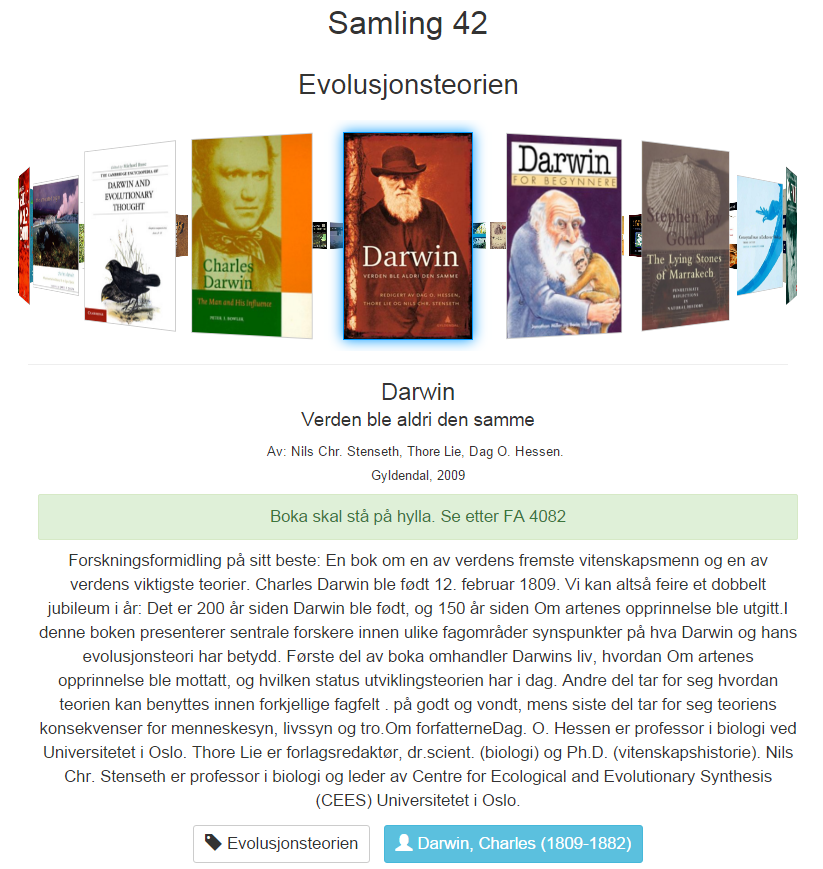
Furthermore, the Colligator, previously developed at the UiO Science Library, provides inspiration. It is a book carousel which allows users to visually explore books using various types of subject headings. A "physical" embodiment of the Colligator can be found on the second floor of the Science Library, where a touchscreen allows library visitors to explore the "Collection 42", a collection of popular science, science history and science philosophy books.
Data preparation
In the last weeks of December, we have harvested the records of books in the UiO library, for example the basic titles and authors of books, but also their subject headings and classification codes. This resulted in a database with a large variety of metadata. Subsequently, we merged this with a set of Amazon records, which contains additional material, such as book descriptions, covers, user ratings and reviews. The rich set of merged records amounts to approximately 300,000 book items. Using extracted subsets of this data, we embarked on an exploration of visualization possibilities.
Exploring visualization opportunities
Myriad possibilities to visualize data exist, both in a visual and technical sense. For our purposes, we decided to utilize D3 ("Data-Driven-Documents"), which allows for a lightweight approach to visualization, since there is an extensive number of visualization examples available, and since it just needs a regular internet browser to run [1].
In our visualizations, we planned to use a number of potential useful data elements, such as classifications and subject headings. The classifications in the library records, such as Dewey Decimal Classification (DDC), allow for hierarchical connections between topics, while for instance the Realfagstermer (Science terms) also include important book aspects such as their main contents, their genre, related geolocations and the timeframe captured in a book.
Sample Visualizations
In our explorations, we initially focused on charts, graphs, word clouds, maps and scatterplots, all briefly discussed below (a short animation of the examples is also available):
1) Interactive bar graphs

We first explored data visualization via interactive graphs. For instance, Figure 1 depicts a bar chart which incorporates Amazon user ratings for books in the Collection 42, as well as book covers. It is possible to hover with the mouse over the bars in the chart, and get details about the book in question. Moreover, books are color coded using their DDC classification code (if available), showing the broad topics of the books. Finally, it is possible to click on the graph to visually reorder it by user rating.
2) Force-directed graphs (network diagrams)
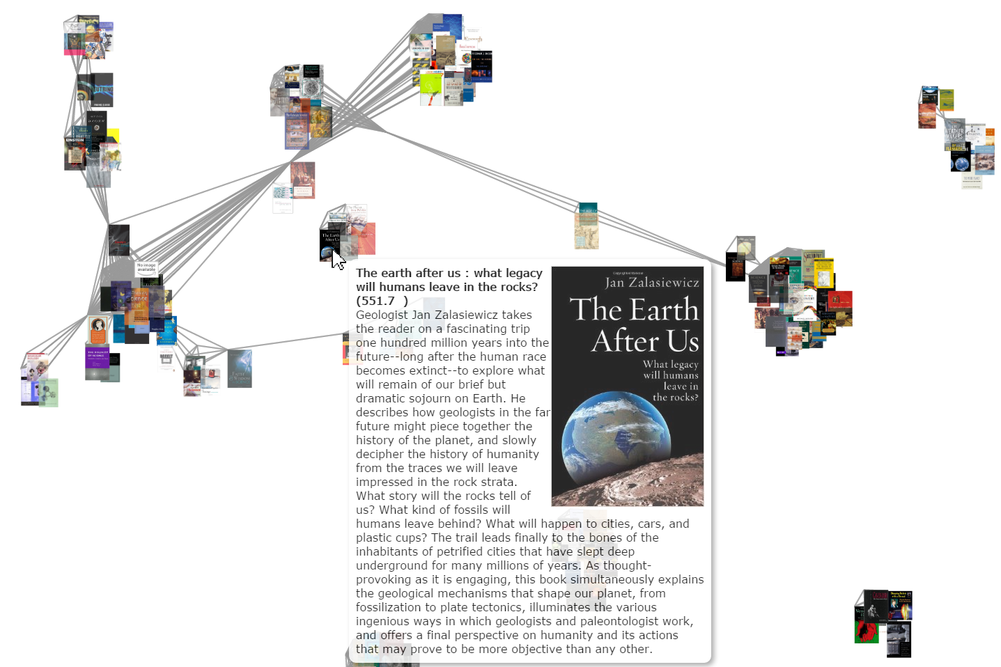
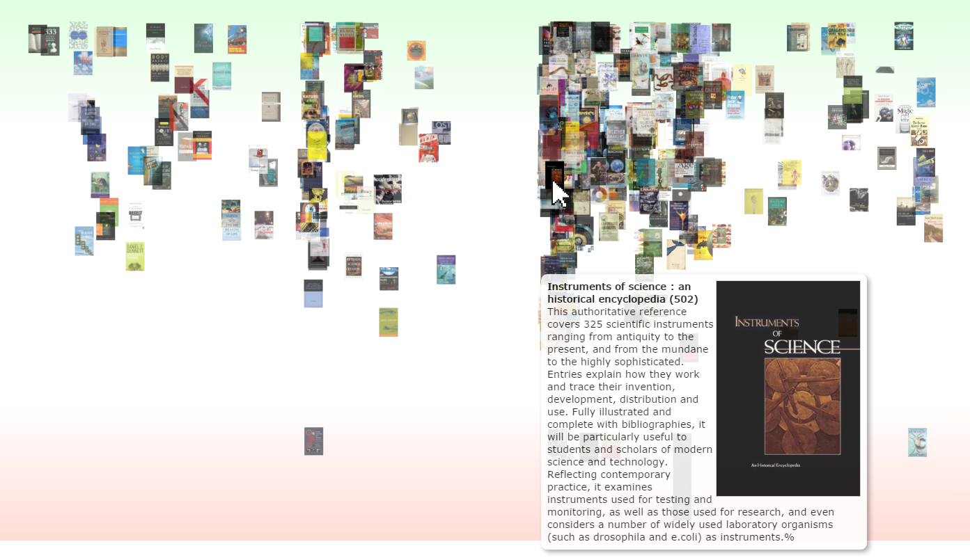
Another way to visualize the library's rich data is via "force-directed graphs". These are graphs "which use simulations of physical forces to arrange elements on the screen" [1]. Hence, objects which are more related will appear closer together. Figure 2 shows an example of a network of books. Here, books are grouped together based on shared DDC codes. It is possible to click on book covers to get their details, as well as to reorganize the contents of the graph. The strength of this kind of visualizations is that they can visualize relationships between books, even though they can become quite complex when more intricate relations occur.
3) Word clouds
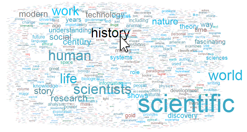
A quite ubiquitous (and at times perhaps overused) method to visualize large datasets is via word clouds, as for instance seen in LibraryThing. While they can be visually interesting, they do not always help navigation in a Web search context, as previous studies have shown. However, when doing open-ended explorations, they may provide inspiration. Figure 3 on the right shows a word cloud based on all book abstracts in the "Collection 42" dataset. Each word's color depicts the average rating for the sets of books mentioning a word, red representing a low rating, and blue representing a high rating. By clicking a word, all books which use this word in their abstract are shown.
4) Geographical Maps
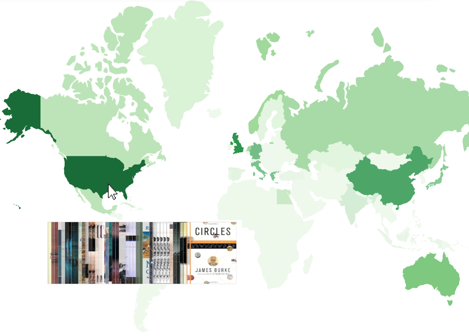
Certainly, also geographical maps can provide inspiration for finding books. The example on the right (Figure 4) shows a screenshot of an interactive map which allows for browsing the books of various countries. Clicking on a country shows books related to that country, based on the assigned subject headings, and deeper colors represent more books per country. This visualization uses the geographical keywords of the Realfagstermer, but could also be used with other vocabularies at UiO, such as Humord.
5) Scatterplots
Finally, one way to show multidimensional aspects of books is via scatterplots. We take a visual approach to scatterplots, and display book covers instead of scatterplot points. The example below shows books from the Collection 42, ordered horizontally by their Dewey classification code, and vertically via their Amazon rating (green representing the highest ratings and red the lowest). As Figure 5 is based on books from the Science Library's collection, it may come to no surprise that it shows a large number of books clustered around the 500 Dewey code, which is the Dewey number for Science.
Next steps
These figures only represent our first steps in visualizing the UiO's library collections and in providing visual navigation. For instance, it possible to harness more of the power of the assigned classification codes (for instance the mappings between vocabularies), and to refine the visual styling of the examples. Furthermore, we plan to utilize data gained from Alma Analytics to provide alternate ways for navigation.
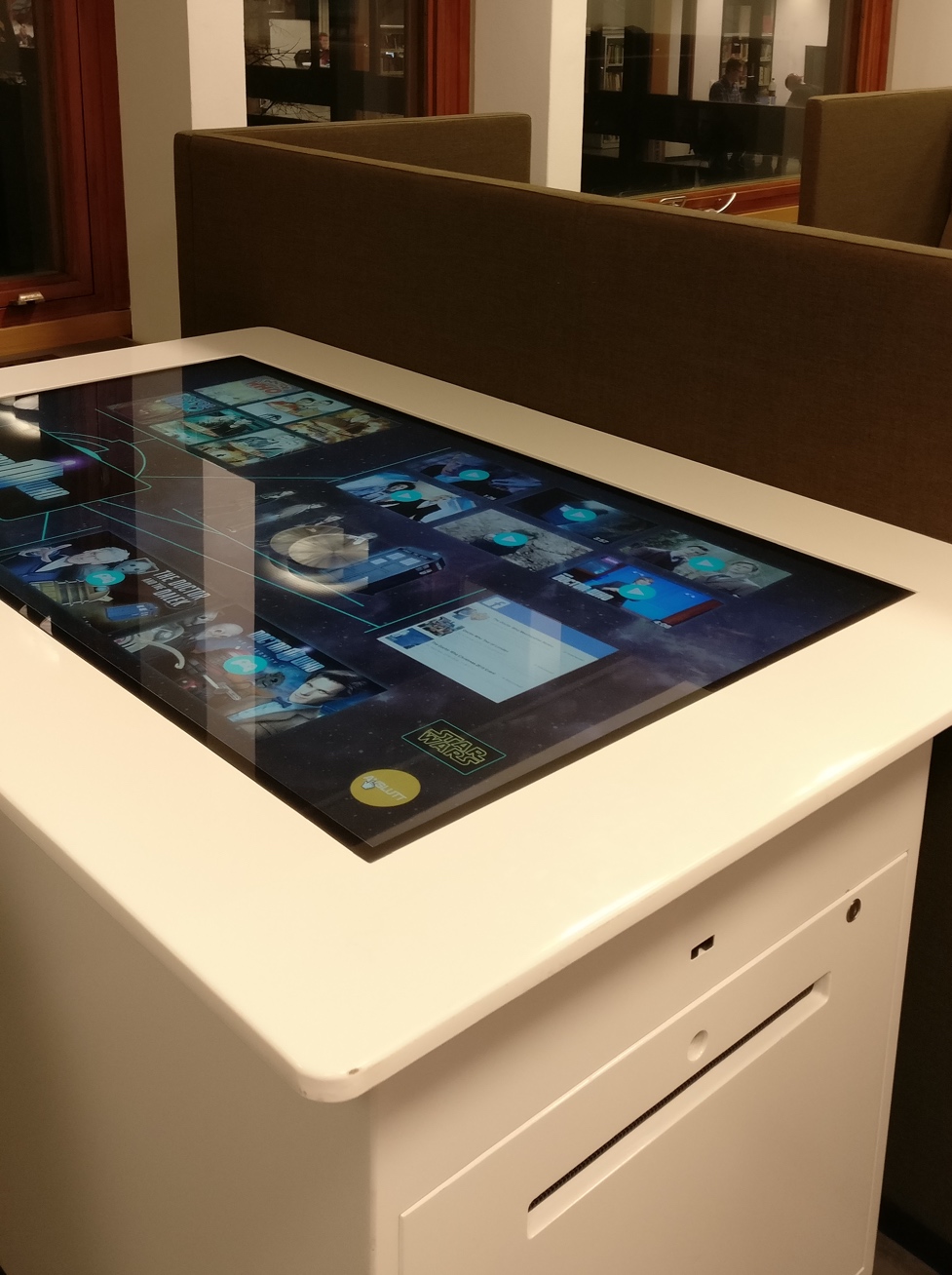 An important point of concern in relation to these visualizations is where, when and how to show them. Some types of visualizations are well suited for large screen spaces, e.g. the network diagrams depicting interconnections between sources (Figure 2), or the scatterplot depicted in Figure 5. We plan to test these using the large surface of our touch table. Other types of visualizations scale more easily to smaller (touch) screens. After finishing our first prototyping phase, we will test out our visual navigation solutions with actual library users.
Check back our website for further posts on the progress on our visualization efforts, which will be posted in the coming weeks. Be sure to contact us if you have any suggestions, ideas or remarks about our initial visualizations, or if you would like to try them out.

[1] A good introduction for using D3 is the freely available online book Interactive Data Visualization for the Web by Scott Murray (2013)
Logg inn for å kommentere
Ikke UiO- eller Feide-bruker?
Opprett en WebID-bruker for å kommentere